
Creating Shadow Point’s Logo
Hi! I’m Hannah, a senior artist at Coatsink. I worked extensively on the environments and level building in Shadow Point, but towards the end of the production I also had to turn my attention towards creating a logo and brand identity for the game. I’ve made multiple logos for Coatsink’s titles previously (noticeably Augmented Empire, They Suspect Nothing, and A Nights Sky), but Shadow Point always felt like it was going to be trickier due to the inherent mystery within the game’s premise. How do you portray such complex narrative in one icon?
Shapes and Forms
The first point of call, as with any artistic endeavour, is to collect a tonne of reference. Shadow Point is set in a fictional area of the Scottish highlands and so I spent a long time looking at Scottish iconography and tourist destinations. Ultimately I strayed away from this direction as I felt it didn’t fit with the tone of the game; the location is important to the narrative, but it’s not one of the defining features.
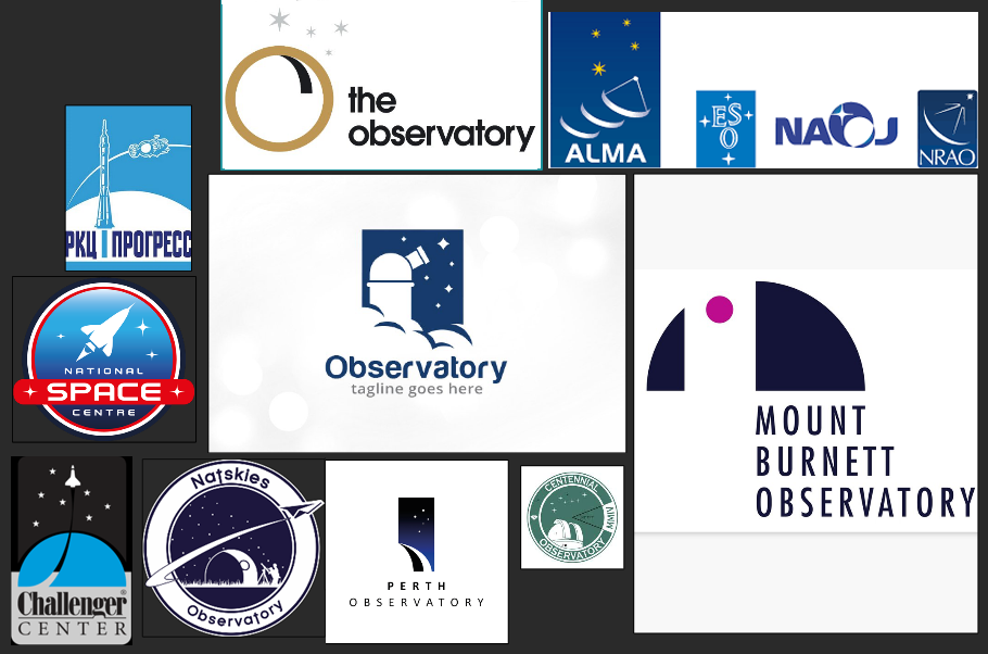
After that I started to look at real-life logos for observatories and space centres worldwide. A lot of these were too sci-fi looking, which was absolutely not the aesthetic we were going for, but I did notice that a lot of them had two distinct motifs – circles (for planets) and swooping arcs to represent star movement. Taking these two characteristics, I tried to incorporate them into very early sketches.
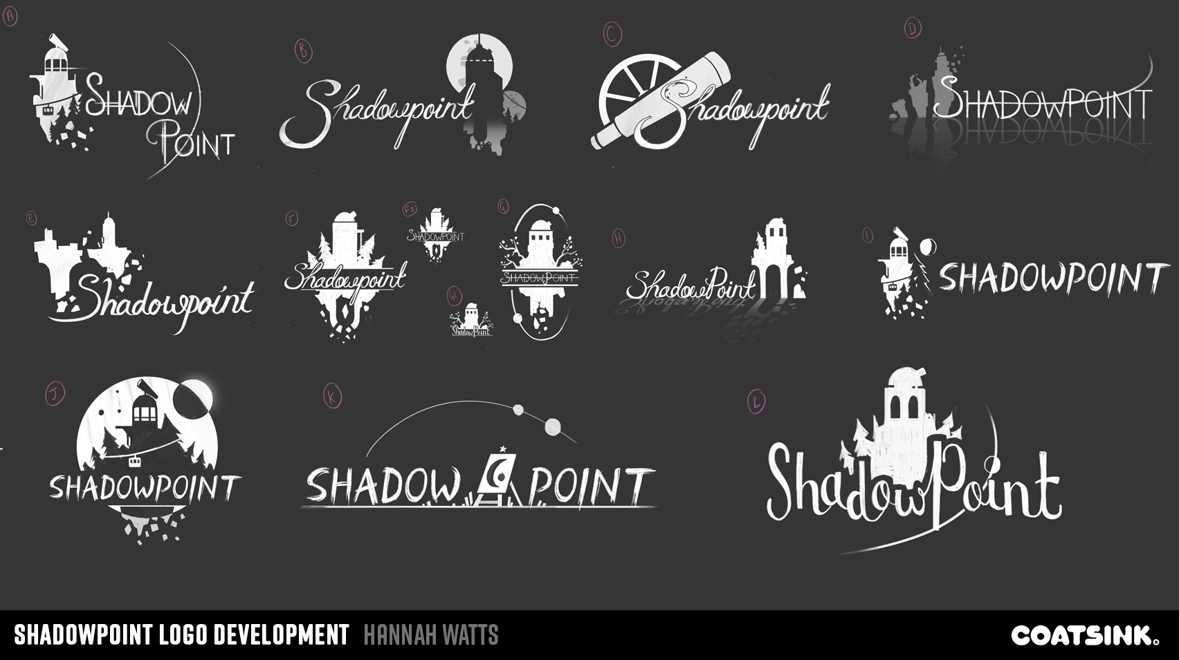
I always work in greyscale first as it allows you to focus on the shapes, values, and composition without getting distracted by colours and shading. My initial sketches are always rough and patchy; I used a textured square brush which gives my lines an even sketchier look – this forces me to stay loose and not get committed to overrendering to any of the sketches.
Inspiration for Shadow Point’s logo
I also briefly explored the more ‘mystery game’ type of look, using ‘Ethan Carter’ and ‘Edith Finch’ as two prominent references. These were strong contenders and were many peoples’ favourites.
Edith Finch Logo
Firewatch Logo
The Vanishing of Ethan Carter
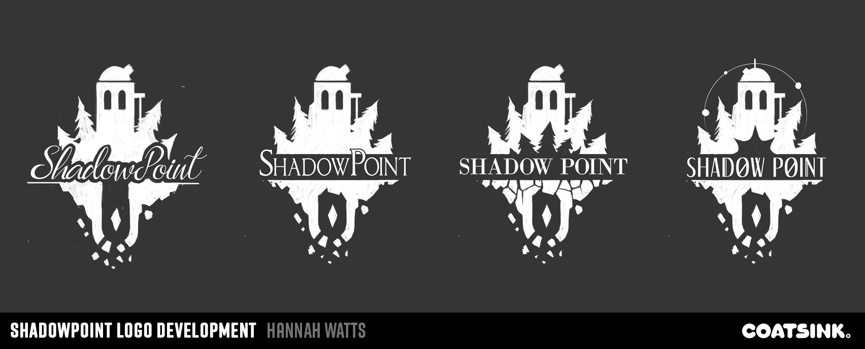
I wanted to experiment with a slightly more bold and graphical style to try and achieve a logo that you could imagine the Shadow Point Observatory using in real life. The environment art team had talked about using it as a decal or mural in the entrance area, so we needed something a bit more tangible. Initially I looked at games like Firewatch for reference, as their logo is very minimalist yet striking and instantly recognisable.
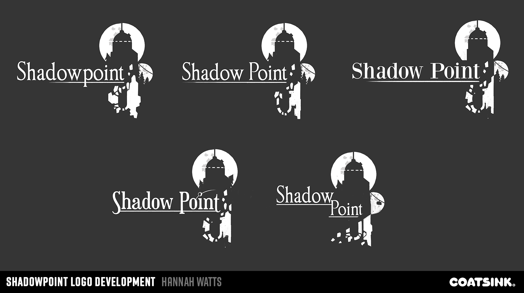
The choice to add crumbling elements to the text was also intended to be a little nod to the later levels in the game – suggesting that all is not as sunny and normal as you might perceive. I’d played with using the crumbling and upside-down elements in some of the logo sketches but we ultimately felt it was a touch too on-the-nose, as we wanted the disruption of the world to be more of a surprise and discovery for the player.
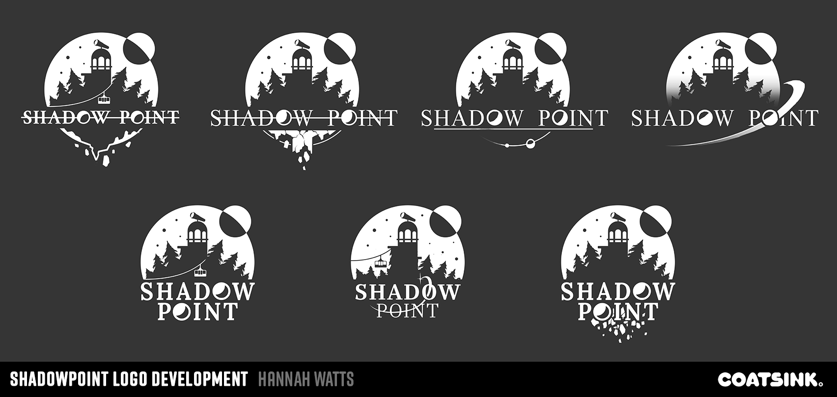
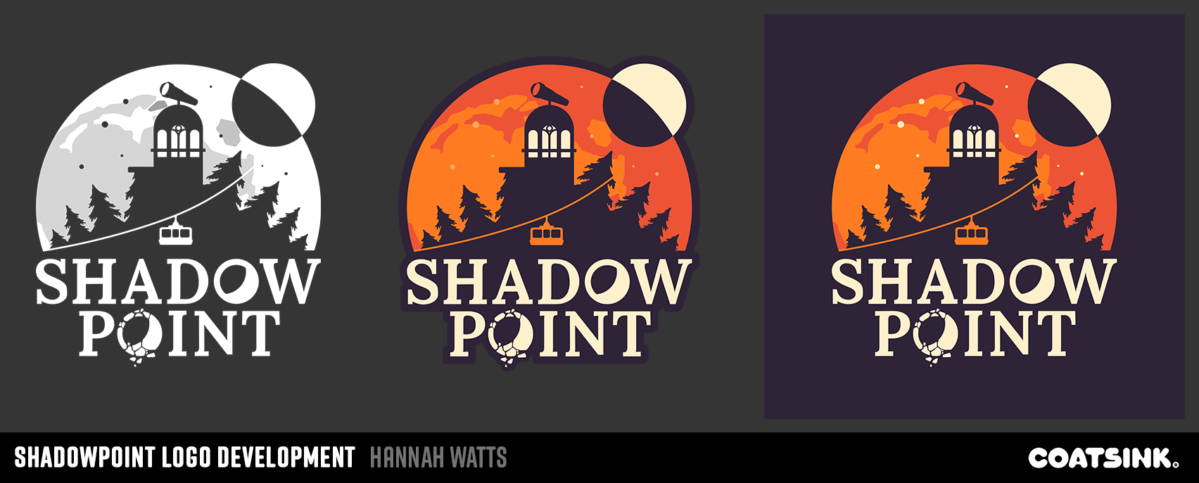
Eventually it was the graphical style that won out by popular choice amongst the team. Creating a mono-white logo first also ensures that the logo can work as a watermark over screenshots and other graphic design assets. The next step was to pick the colours.
Choosing colours
The colour palette was another tricky choice as the game takes place in multiple lighting conditions and environments. They range from ethereal blues, to sunset, to bright Mediterranean midday. After reviewing all of the levels again, myself and the marketing department decided that sunset colours represent Shadow Point the most as this is where the game begins. It also helps that oranges and purples are very striking and bold colours! I started constructing colour palettes to test by colour-picking from sunset photography and, strangely, 70s holiday brochures.
The key art for the game (this is the ‘store art’ used in digital storefronts) was another discussion we had to have! The logo is fairly complex due to a number ofsmall details, so it was imperative that we used or created an image that had areas of rest for logo placement. We toyed with using in-game screenshots, but ultimately the decision was made by the art team to go with something painted so that we could communicate the overall location a bit clearer. As with any painting, I started with rough sketches to test the composition. There was a few rounds of feedback and back and forth to push the image closer to something that suggested elevation and sunset.

I hope this little insight has been useful to any aspiring logo designers out there! As always, It has always been an honour to be tasked with giving an identity to a product that the whole team at Coatsink has worked so hard and passionately on.

Hannah W - Senior 3D Artist
Hannah is a senior artist at Coatsink and has been with the company since 2016. Currently, she is the art lead on an exciting unannounced project. She specialises in 3D environments and prop creation, and enjoys working in a variety of styles.


Northern Design Centre, Abbott's Hill, Gateshead, NE8 3DF
© 2011 - 2025 COATSINK SOFTWARE LTD. ALL RIGHTS RESERVED.
All trademarks referenced herein are the properties of their respective owners.